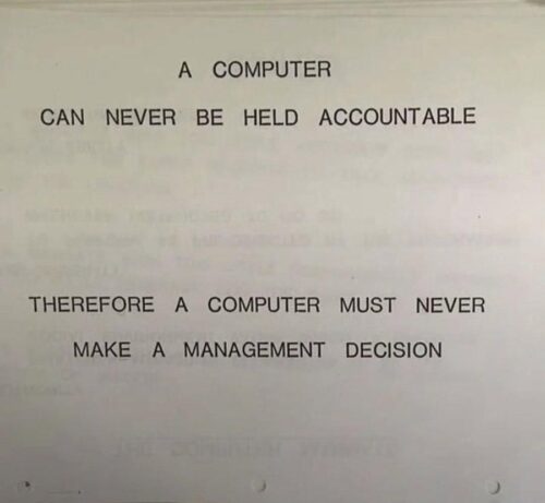
Jeg har tænkt en del over, hvorfor jeg får en klemt følelse i maven, når emnet falder på vibe-coding, altså AI-assisteret udvikling uden menneskelig kodevalidering, og jeg tror endelig, at tiøren faldt, da jeg doom-scrollede forbi det vedhæftede billede, som er fra en IBM-træningsmanual fra 1979.
Når man arbejder med ambitiøse, dygtige mennesker, opdager man hurtigt, at de bedste løsninger bliver skabt, når man giver kontekst og frihed i stedet for kontrol og topstyring.
Med den frihed kommer ansvar, ansvar for beslutninger, ansvar for leverancer og ansvar for kode. Men hvordan kan man tage ægte ansvar for noget, man ikke forstår og hvordan står man inde for kode, man ikke har taget stilling til? Derfra opstår kernen af min bekymring.
Betyder det, at mennesker ikke laver fejl, når de koder? Nej. Betyder det, at alle programmører i dag tager ansvar for og fuldt ud forstår deres kode? Niks. Betyder det, at AI-assisteret udvikling er værdiløst? Selvfølgelig ikke.
Men selv når vi når dertil, hvor en AI-model på egen hånd kan bygge kompleks software af høj kvalitet, så er det værd at huske på, at man ikke kan stille hverken OpenAI, Anthropic eller Google til regnskab, hvis noget går galt.
A COMPUTER CAN NEVER BE HELD ACCOUNTABLE
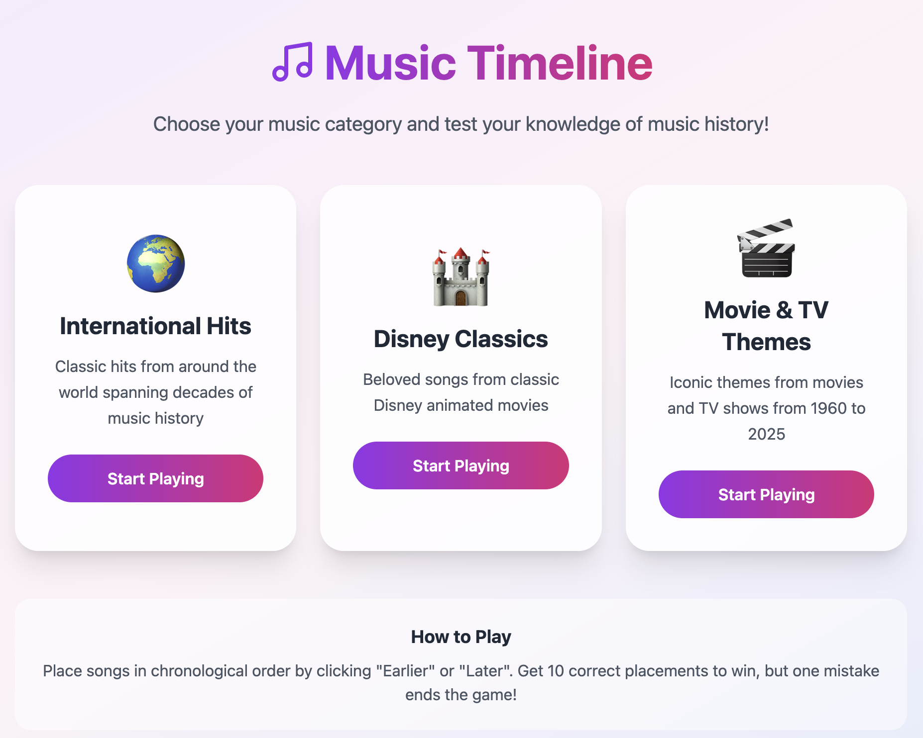
Testing Vibe Coding: Music Timeline Quiz
Vibe coding is all the rage and I wanted to test it out after playing a fun game, Musik Quiz Kampen, recently. The game consists of a bunch of cards, each representing a song, which you then have to place in a timeline by release date without knowing the artist or song title. This works by scanning a QR code on each song card, which then allows you to listen to the actual song.
I thought it would be fun to build a digital version of this, so I got to work using bolt.new. After around 1 hour of work, I ended up with the below game, which can be played here. I was quite impressed with how fast it was to get up and running, the only challenge was finding an API to fetch the song previews. If this had worked out of the box, this would all have taken 10 minutes to build.

Automatically Avoiding Sporting Event Spoilers on iPhone
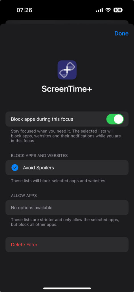
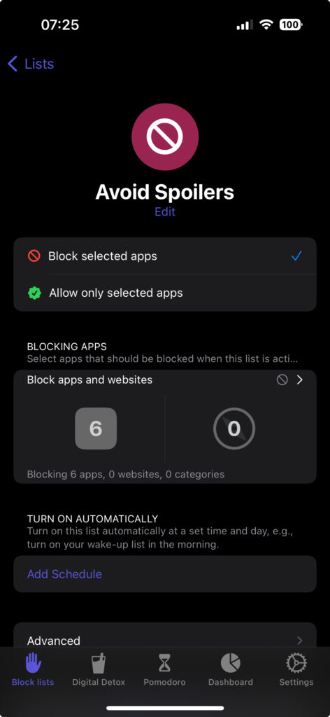
I don’t watch a lot of sports, but when I do, I normally watch events shortly after they’ve aired. This makes it very likely to stumble upon spoilers on social media or in the news. To try to solve this I have a Focus set up on my iPhone called “Avoid Spoilers”, which disables notifications from apps that may spoil me, e.g. Facebook’s Messenger app, where my friends routinely discuss the events live. This Focus also prevents me from from opening social media apps, like reddit, accidentally, since it’s connected to the ScreenTime+ app, in which I’ve set up a rule disallowing the opening of social media apps:
I then enable this Focus when a sport event starts that I know I’ll want to watch later, and then keep it enabled until I’ve watched the event. However, I’ve been wanting to automate this completely, so that this automatically gets enabled when the sporting event actually starts, and I finally found a neat solution for this.
Automation using Shortcuts app and IFTTT.com
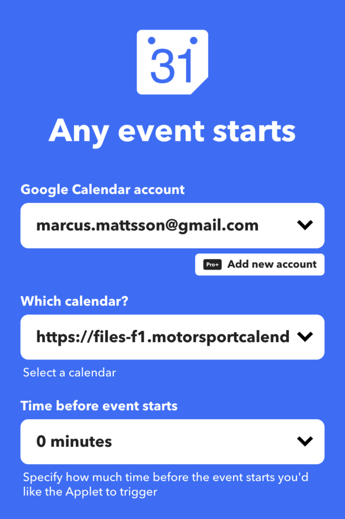
The Shortcuts app on iOS supports a number of automated events that can trigger any of your Shortcuts. One of those triggers can happen when receiving an email, and this got me thinking that since I have a calendar with the sporting events I follow, e.g. Formula 1 races, maybe I could automate sending an email every time an event starts in that calendars, which in turn could trigger a Shortcut which enables to “Avoid Spoilers” Focus. So this is what I did:
- Ensure you have a sporting events calendar in, say, a Google Calendar account
- Create an IFTTT.com account using an iCloud email address (this becomes important later)
- Create a new applet with the following:
- Tap “If This”, open the Google Calendar service and pick the “Any event starts” trigger
- Connect and pick your Google Calendar account, pick the correct calendar and choose time before the event starts, e.g. 0 minutes. Then create the trigger
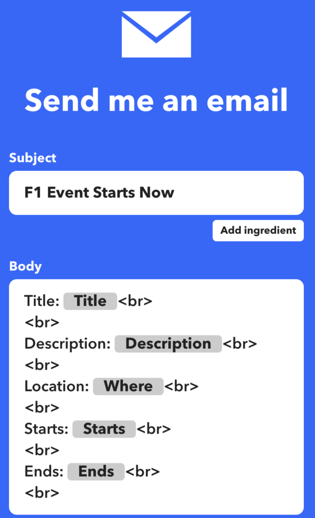
- Tap “Then That”, open the Email service, and pick the “Send me an email” action
- Choose the subject you want, e.g. I chose “F1 Event Starts Now”, do what you want with the body, and create the action
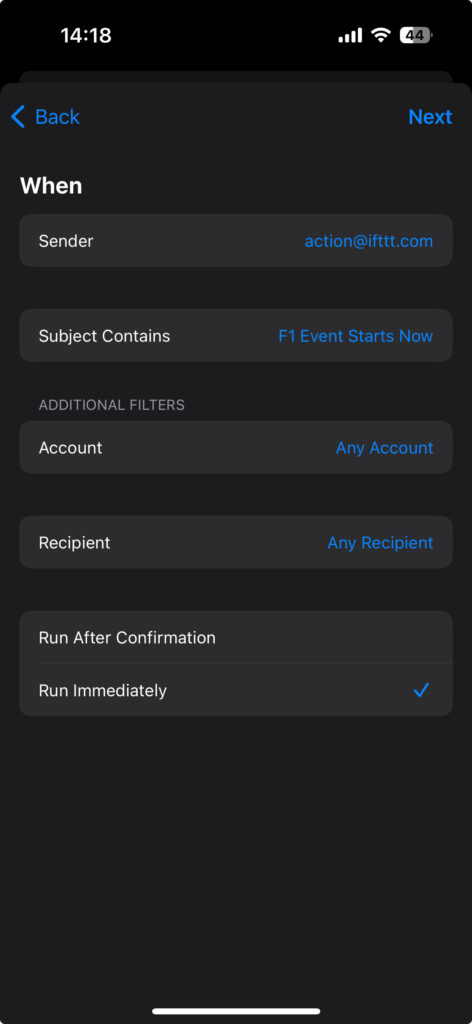
Now we’ll need to go into the Shortcuts app’s Automation tab and do the following:
- Create a new automation by tapping the top-right plus icon
- Choose the “Email” trigger and configure as follows:
- Sender: action@ifttt.com
- Subject Contains: The subject you used in your IFTTT applet, e.g. “F1 Event Starts Now”
- Account: Any Account
- Recipient: Any Recipient
- Choose “Run Immediately” at the bottom
- Tap “Next” in the top right
- Choose “New Blank Automation”
- Tap “Add Action” and find the “Set Focus” action
- Configure the action to it says: “Turn {Focus Name} On until Turned Off”, or however you would prefer it to be
- Tap “Done” in the top right
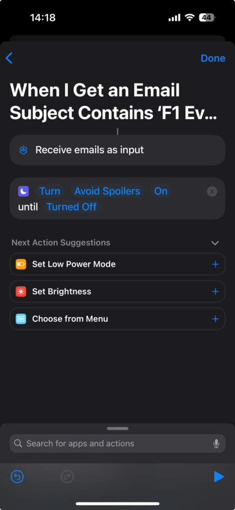
You should now see the automation in your Automations tab.
Lastly, we need to make sure your Mail app is set up to receive emails immediately when they are sent. On iOS, this is only possible using iCloud email accounts, any other account can only have new emails fetched, at most, every 15 minutes. This is why it was important to use an iCloud account for IFTTT, since the action there only sends emails to the account email address.
To ensure this is properly enabled, do the following:
- Open your Settings app, then “Mail”, and then “Accounts”
- If you do not see the iCloud account you used for your IFTTT account, then add it by tapping “Add Account”
- Once added, go back to the “Accounts” screen, open “Fetch New Data” and make sure “Push” is enabled at the top of the screen and for the iCloud account itself
That’s it, your Focus should now enable automatically whenever you receive a trigger email.
Cykling
Herude på landet, der cykler folk meget. Som i, det er normalt at ende bag 10 prustende, midaldrende mænd med øldunk, cykelgrej til titusindvis af kroner og stramme, matchende holdtrøjer. Du ved, en af de moderne former for uironisk midtvejskrise.
Da Corona så ramte, lukkede mit lokale Crossfit-hold og jeg skulle ikke længere cykle til arbejde dagligt. Så jeg købte en billig racercykel. Og det var da hyggeligt nok at køre lidt rundt i området på den. Og så fik jeg ondt i hænderne og købte cykelhandsker. Og en bedre cykelhjelm. Og en iPhone-holder til styret. Og i dag kom min nye sadel. Og i weekenden brugte jeg to timer på at finjustere gearet, fordi jeg synes det var hyggeligt. Hyggeligt.
Jeg ved, hvad en bagskifter og en forskifter er. Jeg ved, hvordan man justerer H- og L-grænseværdi-skruerne og hvordan man indekserer gearet. Min YouTube-forside er kun cykelvideoer, og når jeg støder på cyklistflokkene, på min egen cykel, med mine 34 år på bagen og 10 kilo for meget på dunken, så nikker de forstående. Og jeg nikker igen.
Getting Up-To-Date Daily Disposable Amount from Bank Account
I use You Need A Budget (YNAB) for my personal budget. It’s an amazing service built up around the idea of “giving every dollar a job”, meaning that you put all the money you have for a given month into a category in your budget. So, after categorizing all your money into “mortgage”, “groceries”, “savings”, etc. you end up with a final amount of disposable income, and this is where I’ve hit a roadblock that’s been annoying me literally for years:
On any given day of the month I want to know how much money I can spend out of my remaining disposable income, e.g. remaining days of the month divided by remaining disposable income. This is annoyingly hard to do with YNAB, because every time I make a transaction I’d have to manually add those transactions to YNAB, see my new disposable amount and calculate my new daily amount. This is not an issue for American YNAB users, because YNAB can automatically import transactions from American banks, meaning you can just check your YNAB app and divide the up-to-date disposable amount with the remaining days of the month. Still somewhat cumbersome, but at least easier than having to manually import transactions.
Also, services like Spiir, that does automatically import transactions from Danish banks, does not help me out here, because the budgetting concept there is built around category spending limits, which I don’t like. So, what I’ve been doing is using the app Pennies, which just allows me to enter an account total, and then it gives me my daily disposable amount. Whenever I buy something I then add a transaction in that app, and it shows me my remaining amount. Obviously, this is not a perfect solution, because Pennies gets out of sync with my actual budget if forget to enter something and I have to manually update the total amount every month.
This all changed, because last week I received a newsletter from YNAB in which they announced their new public API! My eyes lit up! Maybe I could build my own YNAB integration, automatically importing transactions from my bank on a regular schedule, and run that regularly on my Mac Mini server. And if I got that working, maybe I could build a small iOS app that uses the same new API to show me my up-to-date daily disposable amount! The only limitation was how to get my transactions exported from my bank’s online banking service. After a quick Google search I stumbled upon Nordic API Gateway, a service that exposes an API for almost all banks in Scandinavia. I couldn’t believe my luck.
After spending some hours scripting, I now have the following setup:
- Node.js script that exports transactions from my bank and imports these into YNAB. YNAB is really clever about detecting duplicates, so I don’t have to worry about filtering out transactions that were already imported. I just import everything going back 30 days. This runs every 15 minutes using cron.
- Node.js script that fetches my YNAB budget, gets the remaining disposable amount, calculates the daily amount for the remainder of the month and then pushes this info as an iOS Push Notification. This also runs every 15 minutes using cron.
- iOS app which has Push Notifications enabled and receives these from the 2nd Node.js script. When it receives the notification it updates its badge with the amount of money I can spend that day.
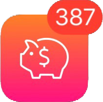
This now means I have a nice app icon on my iPhone that always shows a badge number with the up-to-date daily disposable amount I can use.
Review: PEBA 1296P Super HD Dash Cam
I recently bought my first car dash cam, a PEBA 1296P Super HD dash cam. I did a lot of research and ended up with the following features I wanted:
- At least 4 stars on Amazon
- At least 1296p resolution
- Circa 150 degrees field of view
- Suction mounting, not glue
- At least a 2-inch screen
- Cabled power
But that was just the technical specifications. It is surprisingly hard to find in-depth reviews of dash cams which actually focus on what’s most important when it comes to cameras that you operate while driving: the user interface and the user experience. Unfortunately when you haven’t owned a dash cam before, it’s hard to predict what kind of UX cases will be important to you.
Before I go on it’s worth noting that dash cams usually work in the following way: the camera fills up the memory card as you drive, automatically deleting the oldest recordings to make space for new ones.
Having used the camera for a while, two common use cases very quickly became obvious:
- Something happens on the road and you quickly want to save and lock the last X amount of minutes from deletion on the memory card.
- Quick and easy transfer of data from the memory card to computer or smartphone.
Unfortunately the PEBA camera doesn’t support any of these in a meaningful way. It does have a feature where tapping the OK button the camera locks a clip against being automatically being deleted, but the feature is useless because it only stores the clip a few seconds back. So, let’s say someone cuts you off or you see something funny and want to store that clip without going through hours of hours of footage to find it, this is not possible with this camera.
For quick importing of the footage onto my iPhone, I bought a lightning to SD adapter, but apparently this only supports a specific list of video formats, and the format the camera is using is not supported. So, I have to either bring my laptop into the car or bring the SD card with me into the house to import footage. Kind of annoying when you frequently like to watch the footage.
So, I will be buying a new camera which supports both of these use cases.
Thoughts on The Last Jedi
Finn & Rose: This storyline just did nothing for me. Rose is such a flat character, they spend no proper time making her interesting. Compare her introduction with Rey’s in Force Awakens. We see and understand so many things about Rey just by watching her on Jukka; her sledding down the dune, putting on the fighter pilot helmet, defending BB-8 and refusing to sell him even though she really needs the money and we feel she’s orphaned and alone by her actions and by the actions of those around her. It’s such a great character introduction, and Rose gets none of that. She’s sad because her sister is dead and later on we get to know she had a shitty childhood. We get told this, we neither see nor experience it, so it falls flat, at least to me.
The scenes at the casino didn’t do much for me either to the point where I groaned at some of the scenes. The aesthetics of the place are amazing, but the whole rescue operation of the horse creatures and the “it’s worth it now” comment at the end felt so forced, especially when you realize they left behind a whole group of slave kids! It also seems like the movie implies that they just so happen to stumble upon another master hacker in Benicio del Toro, which seems ridiculous after Maz specifically points out that these are incredibly hard to find.
But the worst part of their storyline is that, in the end, they get a bunch of people killed and their plan completely fails, when del Toro betrays them and tells Hux about the escaping transport ships.
This movie really, really does not want you to think that going on a sacrificial, hero-journey to save people, is a good idea, because it fails for more or less everyone who tries it in the movie.
Poe, Holdo & Leia: Why exactly is Poe not in chains at the end of the movie? He disarms a vice admiral at gunpoint and attempts to ruin her escape plan. And why, when Poe is holding Holdo at gunpoint, doesn’t she just TELL HIM that the First Order won’t notice the escaping transport ships? Why doesn’t Poe know this himself?! Such a ridiculous storyline. And I found Leia’s Mary Poppins flight pretty silly, that just did not work for me. I actually felt that would’ve been a decent choice, to have her killed there, to set the stakes for the rest of the movie.
Hux: This guy must be the most incompetent military leader in the movie series’ history. He doesn’t manage to block the evacuation, he doesn’t realize that Finn and Rose escape and he doesn’t see the escaping transport ships until del Toro’s character tells him. I loved the scene in the throne room where he’s just about to shoot Kylo though.
Rey & Luke: I’m not sure what I think of the scenes on the island. I loved Luke’s reaction to Rey’s first meeting with the dark side, that she just plunges in. I feel like they justified her ambivalence between the light and dark very well, but the mirror scene made no sense to me. I assumed that was a source of the dark side of the Force, but she just goes there, looks in a mirror, sees herself and that’s it? I really liked the scene with Yoda, even though it seems like the movie makes a bit of a mockery of that scene’s point when you see that Rey actually brought the Jedi scripture with her.
Kylo & Rey: The best part of the movie for me. The interactions they had actually felt real, their connection felt real and I was convinced by the supposed sympathy they get for each other. Rey’s arc here, where we actually get the feeling she may turn to the dark side – now or later – is the most impressive part of the movie to me. This is exactly what never worked in the prequels, I was never convinced by Anakin’s fall to the dark side, he just felt like a petulant, spoiled child. With Rey, I get the feeling that there’s so much anger just below the surface, that she could explode at any moment, that she’s so deeply hurt by her parents’ abandonment that she’s filled to the brim with a desire to get some sort of resolution even if that means tuning to the dark side.
And Adam Driver fucking nails his performance. Kylo feels so enraged, frustrated and sad that when he and Rey feels a connection, the relief for Kylo is palpable, it feels like this is what he needs and what he’s wanted for so long without knowing it; an ally who understands him and his rage.
During the throne room scene, however, this is all thrown out the window. When Kylo asks Rey to join him, I actually felt like it would be believable if she did. But she doesn’t and then it seems like, for the rest of the movie, all ambiguity is gone and those two characters go back to being exactly how they were at the end of Force Awakens: Kylo bad, Rey good. That felt like such a wasted opportunity to me.
Kylo & Luke: Second-best part of the movie. When they reveal that Luke tried to rage-kill Kylo I was flabbergasted, that felt so stunningly amazing and it made Luke’s shame so much deeper, so much easier to understand. I absolutely loved that I actually had to consider if Luke would now try to kill Rey. I think this movie could’ve been one of my all-time favorites if they had actually gone along with that plotline, if Luke does feel obligated to destroy Rey because of the immense darkness in her, and she then escapes, which pushes her directly into the arms of Kylo, ending up with a stand-off between Kylo and Rey, the disappointed apprentices, on one side, and Luke on the other. Then the final movie could be about getting Rey back or something. As it is now I feel like The Last Jedi ends with Kylo and Rey in basically the exact same place as at the end of Force Awakens. Rey shuts the door on Kylo, she rejects him and what he stands for, but that was already her stance at the beginning of the movie.
Luke: What the fuck was that ending? It finally feels like we will see Luke in battle and then he’s a fucking hologram? He’s not even there? I was ready to see him crush some fucking walkers! And please, for the love of God, someone explain to me why he dies afterward? If he had to die, then why not actually have him there and give that scene with Kylo meaning?
Stædigt design og brugeradfærd
De seneste måneder har jeg været vidne til en pudsig kamp mellem de daglige gængere på Øresundskollegiet og kollegiets viceværter. En af udgangene fra kollegieområdet er nemlig indrettet sådan, at man hurtigst når udgangen ved at gå imellem en række buske i stedet for at følge stien rundt om buskene. Disse buske er derfor ødelagt, forsvundet, til fordel for en ny sti, en såkaldt desire path.
For at forhindre dette har man opstille en bom, så adgangen til stien er fjernet, og sået nye buske. Disse er nu groet til og derfor blev bommen igen fjernet. Til ingens overraskelse er buskene nu igen ødelagte og stien tilbage, fordi folk igen går igennem stien, nu hvor der igen er adgang.
Samme situation udspillede sig ved Ingeniørhøjskolen, hvor folk maste sig igennem buskene for at nå ind til busstoppestedet. I stedet for stædigt at opsætte barrierer, forstod man, at man oprindeligt havde lavet en designfejl og anlagde i stedet en trappe til alles glæde. Hurra for pragmatik og selverkendelse.


Marshall Acton

I finally bought a Bluetooth speaker. I ended up purchasing the Marshall Acton, partly because of The Sweet Home’s recommendation. I really just wanted a decent looking speaker with at least average sound quality, but I’ve really found myself adoring this product, I want to use it because it’s fun to use, and I’m quite surprised how well-designed this product is. It may be the product I’ve most enjoyed using since I bought my first iPhone. And here’s why.
The state of usability when it comes to consumer products is, generally, abysmal. For instance, if we look at B&O’s Beoplay line of portable speakers, products which have been generally well-received, we find aesthetically pleasing products with absolutely horrendous usability. The entire interface is made up of buttons that don’t feel particularly well-made. The tactile feedback is mediocre and the layout and design is unintuitive.
The Marshall Acton instead just re-uses what already works. Using a dial to change volume is a masterful piece of design: The feedback is immediate, it’s very easy to gauge where the lowest and highest volume points are and you have fine-grained control over volume changes.
Using a button to change volume, especially when there’s no screen for visual feedback, is just not as enjoyable or easy to understand. The only feedback you get is vocal, you may hear a beep to signify the volume change was registered, but that’s it. You don’t know where the lowest and highest outputs are and the fine-grained control you experience using a dial is gone.
Similarly, the Acton uses a good old mechanical switch to turn the speaker on and off. You can’t not know the speaker is turned on, because the visual state of the switch clearly shows it. Not so with the Beoplay speakers, where a single button is used. You hold down the button and the speaker beeps to signify it’s turned on. The button now lights up to show it’s turned on, much harder to see and understand than a simple switch. To turn the speaker off, you don’t just press the button, you have to hold it down, because the designers realised that it was too easy to mistakenly turn off the speaker if all it took was a press. That’s bad design, it’s unintuitive and the feedback is easy to misunderstand.
The Marshall Acton has two input types, Bluetooth and mini-jack. Most of the Beoplay speakers support both input forms, too, but the Beoplay speakers – most likely in the name of minimalistic and pleasing aesthetics – hide the mini-jack port behind a flimsy, plastic door. The Acton put it in plain sight, it integrates it as a part of its aesthetics with a beautiful, coiled, gold-plated cable. The Beoplay speaker automatically switches inputs, so if a mini-jack cable is connected to an audio source, the speaker uses mini-jack. That’s not obvious to the user, there’s nothing on the speaker which signals which input is used. That’s not the case with the Acton. It has two lights which show which input source is used and you switch between the two with a button marked “Source”. And it may sound silly, but the buttons itself are a joy to use. The tactile feedback is great, the clicking sound is great, it feels well-crafted, it makes you want to press the button.
The last button, which both the Beoplay speakers and the Acton have, is the Bluetooth pairing button. It’s as well-implemented as can be done when using the Bluetooth protocol: press the button to initiate pairing, which is shown by the Bluetooth light blinking, and you can then choose the Acton in your audio source’s Bluetooth settings. This is basically the same flow for the Beoplay speakers.
So, I love my Marshall Acton. I love how physical the interface is, I love that it feels well-crafted, I love using an actual dial to change the volume, I love feeling the “click” when I flick the switch or press a button, and I love how each button, switch and dial has a dedicated function. I even love the power cable, it’s one of those standard figure 8 cords that you find everywhere, so it’s easily replaceable. And the sounds quality isn’t bad either! For 1.500 DKK this is an amazingly well-crafted Bluetooth speaker.
D&D 5 Spell Book
I’ve been playing Dungeons & Dragons 5 in my sparetime for a while, and it’s very annoying having to look up spells in a big, alphabetized list, so I made an app!
It’s quite simple, it’s just a list of spells, a settings view for inputting the variables needed to calculate how many spells you can have prepared and a couple of filters. It’s very much work in progress, but I wanted to post a short video of its current state here.