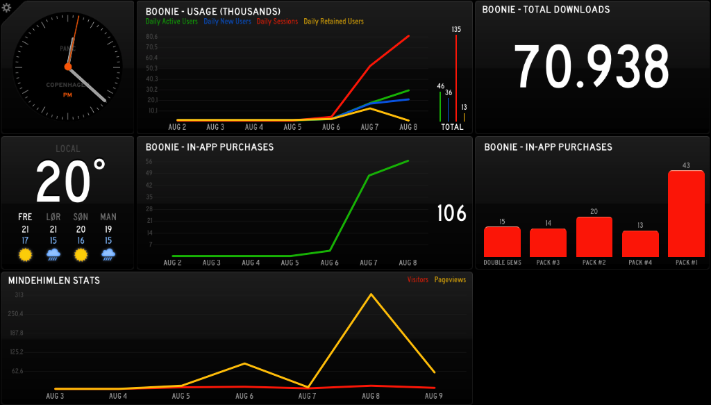
I’ve loved Panic’s Status Board app since its launch, and since we’re on the brink of launching two products – the iOS app Boonie Bounce and the web game Mindehimlen – it’s the perfect time for some nicely formatted visualizations of usage data. So we at GearWorks bought an Apple TV and I found a bunch of widgets to suit our needs.
Mindehimlen runs Google Analytics, and I was lucky to find a PHP script which fetches visitor count and page views for a specified site, so that was quite easy to get going. Boonie Bounce runs Flurry Analytics, and while I found a Flurry widget, it was written in Ruby, and I really just wanted it to run on our web server in PHP, so I made a port. I then modified it to suit our specific needs, so we now have two line graphs, and two bar graphs, showing daily usage (active users, new users, sessions, retained users), daily in-app purchases, total downloads, and what kind of in-app purchases people have made. It looks like this:
Note: The data in the screenshot is made up for testing.

